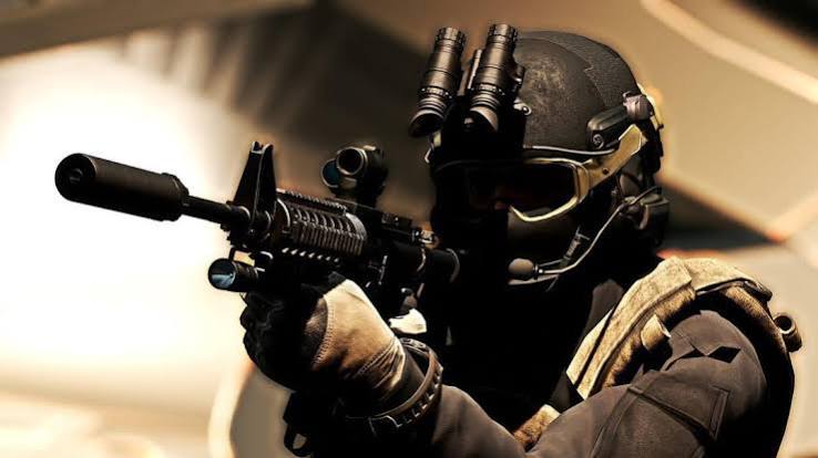
Tactical Shooters
5v5 ranked scrims every week with in-house coaching.
See ScheduleCurrent layout:
This text is controlled only by CSS media queries in css/media.css.
On mobile the headings and paragraphs are small, on a tablet they become medium,
and on a desktop they are the largest. Resize the browser window to see it change.
Breakpoints used: mobile is the default (below 768px), tablet starts at 768px, desktop starts at 992px.
Desktop: three cards side by side. Tablet: two in a row. Mobile: stacked vertically.
5v5 ranked scrims every week with in-house coaching.
See Schedule
Weekend cups for racing and sports sim fans of all skill levels.
See Schedule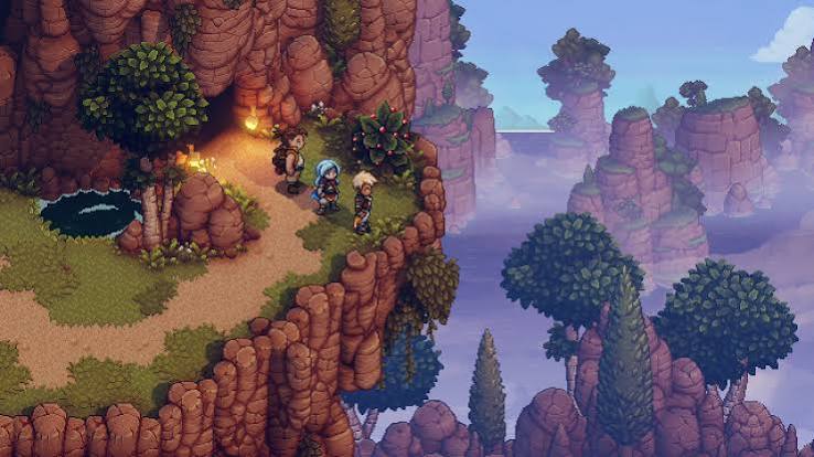
Guild raids, dungeon runs, and story nights with the squad.
See Schedule